Monday 11 October 2010

Marcus Rees Roberts

Marcus Rees Roberts, is an artist I have been aware of for quite a while.


Technical combinations include digital, etching and screenprint,  etching with digital chine colle, digital, screenprint, etching and collage also etchings with digital chine.

 “Study for a Stabat Mater” is my favorite
This link takes you directly to his artwork 
This is the main address of the gallery that exhibits Marcus's work

Tuesday 5 October 2010

Cecilia Mandrile


I first came across Cecilia's artwork about 10 years ago - I believe I saw it in Grapheion magazine , a bi lingual (English, Czech) art journal, previously published about 3 times a year but now once a year if things are going well. Grapheion is a very interesting publication so its well worth a look. 

That particular article had Cecilia's  doll forms photographed on the waters edge,  somewhere in South America............but I could be wrong as to the location - anyway I liked them very much and just the idea of taking them to different palaces and documenting them in different contexts.  Wish I had that original image I saw.  I am pleased to see that Cecilia has finally gotten around to getting her own website together ( like me) .....you can see more of her work and the ideas behind it at her website


Sunday 5 September 2010

Mary Hood

 "Planet 2"  is made using  inkjet monotype and relief
This one which is my favorite is made using Inkjet, monotype, relief and watercolor.


I came across Mary's excellent work a few months back and it's always interesting to see any new work she uploads to the web.  I truly find the way she integrates inkjet and traditional printmaking techniques to be excellent.  You can see more of here work HERE


Russell Crotty


I really like these globular works which Russell makes in 2d and 3d.  His subject seems to be mainly the world of  astronomy and  landscape .  He primarily uses   pen, ink and water colour.  Interesting website - take a look .  http://russellcrotty.com/

Paul Furneaux


While recently exploring the web for information on artist printmakers using the moku hanga (Japanese method of woodblock) I was delighted to come across this work by Paul Furneaux.  Just gorgeous.

To see more of Paul's work and to find out more about the technique check out his website

http://www.paulfurneaux.com/

Wednesday 1 September 2010

Inkjet on etching

This was a major step for me. Until this point I had only ever done traditional printmaking techniques ON TOP of inkjet prints.  Or I had made prints, using traditional printmaking techniques (mainly intaglio)  and then incorporated  chine colle  (which were inkjet printed onto lightweight Japanese paper).  

My hesitation had been somewhat coloured by my apprehension with regard to feeding 'foreign bodies' so to speak, through my expensive Epson R2400 printer.  I mean I didn't want to wreck it.
I started the image from scratch with this objective in mind, i.e., that I would overlay the inkjet on to the proof. So I guess the print started its life inside the computer with the 'overcoat'.

Physically - I started with the figurative image well that is, in terms of actual preparations .  I made a positive in Photoshop as a bit map,  to put onto the light exposure unit we have at FDPW.  It's a very basic one but I am familiar with using it by now.

My aluminium plate was first degreased, then I applied a layer of roll on "Fotec",  photo etch,  emulsion.  This was put to dry,  in our drying cabinet. I got the emulsion from Intaglio Printmaker suppliers in London.  I like that I can phone them if I have difficulty with this process (although I am used to it by now so don't need to) but when you are starting out its really helpful to have that technical back up.
Once dry it was removed and allowed to cool to room temperature.  Then I put the light box on to heat up, ours takes ten minutes.

When I do any printmaking process that requires precise measured timeing  - I find it is essential to have a digital timer, otherwise I get distracted especially if I am talking to other workshop printmakers.
I then put my positive which is printed onto inkjet acetate and place it over my plate which has the dried, cured emulsion on it.   Masking tape is stuck onto the back/side,   to keep these together and in place.

Onto the glass top U.V. lightbox, I place the items  - in this order

my positive on acetate        then my  "foteced" plate      then black paper or foam
On top of which, I put  some weight to enable the plate/positive to make good contact with the UV light source.


This is  in the form of a batch of old metal plates that we keep by the UV box for this purpose.
I then expose the plate to the UV light for 3 minutes.  I forgot to mention that I have already prepped the washing soda crystals mix,  for developing the plate - after it has been exposed.

It's a mix of 10 grammes of washing soda crystals to 1 litre of water (room temperature).

Having said that , in fact, personally, I always add a little boiled water from the kettle to the measured out,  washing soda crystals to make sure they are dissolved  and then I  make the mixture up to the 1 litre mark, on the plastic jug.
That was all I needed ( I mean,  1 litre)  as it was a small plate and I had a small plastic tray to develop it in.  I also put some  water (room temperature) ,  in a similarly sized plastic tray to drop the plate into after it has been in the developer.
Once the plate has been developed in the tray with the soda crystals and 'looks' right,  I rinse it in the other tray.

OK.......... once that's done I put the plate to 'cure' on the UV box.  I leave it on there for about 5 minutes.  Then it's ready to put into the mordant.

Being as it's an aluminium plate,  it is put to etch in a mix of copper sulphate crystal powder and a measure of salt.
I still am so pleased that I can do this at home as and when I wish.  It's great not to have to go into the workshop to do this. This must be so great for those printmakers who are miles and miles away from an open access print workshop or who maybe cannot afford the costs.

The other good thing where etching  aluminium is concerned,  and one of the reasons I wanted to get used to doing etches with it - is that the' spent mordant'  can be disposed of down the drain whereas   copper sulphate mordant, used to etch zinc,   has to be disposed of using a specialist.

 Having said that I remember now,  reading on Nik Semenoff's website  New Directions in Printmaking , that if you add something to it,  the mordant becomes neutralized,  making it safe to dispose of,  in a domestic drain.  The link takes you straight to the article.

I am so grateful to people like Nik, who generously share their research, their knowledge.  It's something I really believe in and why I have always endeavored to give precise descriptions of my technical processes.  Once a teacher always a teacher!!........  there is that as well.
But I have learned from others on the internet and I just want to repay the compliment.
Enough already!!

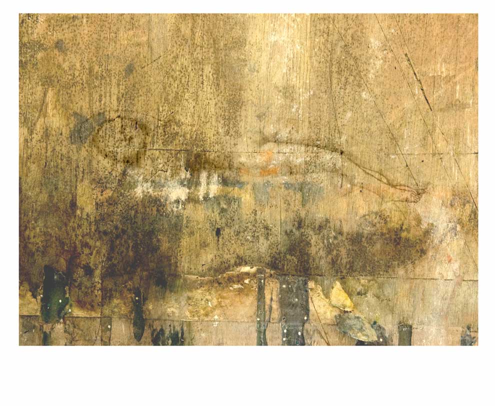
Anyway..........so then I took a proof and was kind of annoyed to see that line crossing down the horizontal figure BUT as I knew I would be overlaying this,  with a layer of ink from the inkjet printer -  I figured it might be OK.  
                     
Of course then I had to go and start trying to be a clever clog- I got this notion that I could have parts of the layer being more transparent than others.  Given that the layer has to have a degree of transparency in any event  - I seem to remember that I got confused at this point.  As can be seen from the image (turquoise  colour),   I was also trying to decide which color to go with.

By this time I had also  scanned the proof into the computer so that I would be able to 'virtually" place in beneath my photoshop layer .


 I also wanted to be able to  output  this layer of ink directly onto the paper.  Measurements and registration was critical.  I had to input the exact paper measurement that I was loading into the epson printer  and have it as a 'custom setting'.

HOWEVER ....I got mixed up about which direction the image comes out of the printer.   It has taken ages to get  used to it and I can safely say that I am no longer intimidated by the beastly thing.

One of the problems with it has been that I use it now and again say on average once every 4 months so I kind of forget how to use it although I have by now printed out all the pages, that I need to refer to,  from the PDF manual that comes with the printer.
Honestly you'd think with a printer that costs 7 or 8 hundred pounds (when I bought it) that they would be generous enough to supply it with a hard copy manual !!  I have also written note on the uses of different types of paper although I mainly use printmaking paper.  I HAVE tried their own brand paper such as their watercolour paper and the Bockingford  double sided paper that you can buy from places like John Purcell or RK Burt.  But there's something rather unpleasant about it in a tactile sense.


It took ages to get the paper to load into the machine and not show up on the screen as "paper loaded incorrectly" or for the paper to just spurt out of the machine.

I take it as a 'given' nowadays that I may have to do about 10 attempts before it finally realizes that I am not leaving the room and that it MUST bend to my will.

The other hurdle to overcome with using this printer is that it has three different entry points for the paper there is front feed, rear feed and upright feed. eeeek !!


Anyway if you click on the image above (fourth up from here)  you can see that I got the inkjet image overlaying part of the etching .

Even though I 'misplaced' the layer of inkjet ink, I was soh thrilled I really was .  What an achievement especially for me a technical nink-a-poop !!
I must have done a couple of more proofs as I seem to still have 2 that I can try this again on, it was late so I went to bed.  This has yet to be resumed.  I did this about five months ago now.  It maybe something I use in a forthcoming project . We shall see...........we shall see.


Saturday 7 August 2010

Capozzi the Art Gangster and Sweet little Bambi ??!!

Well thats what it looks like to me - and I am sure Robert (Capozzi) would have something different to say.  I have just been looking at his website and Blog and believe me - that guy gets himself / his artwork about the place .  Which is a good thing.  I quite like this image by him - its different and contemporary.  His website and blog is certainly worth having a look at too.  


The work is titled  Sub-Rosa” . Apparently Robert says (in his blog) "the term sub-rosa, or “under the rose” is used in English to denote secrecy and imply covert activity.


I noticed that  he had his proposal selected and thereby  participated  in  Graphica Creativa ‘09,
held at Galeria Harmonia where I had my work exhibited a few years ago as part of  "Printmaking at the Edge" through being an artist featured in Richard Noyces book of that name.
I also submitted a proposal for a collaborative installation with my good friend Elisabeth Omdahl (Norway) for this exhibition, but  it wasnt selected.    As I said to Elisabeth in an email I sent her about a week ago I think it was as much the manner in which one proposed to EXECUTE the 'collaborating' as the aesthetic of the work itself which I think was more the emphasis in our proposal.  I have come across one or two other artists who had works in that show and wasn't that impressed with any of it, of course it's all a matter of personal taste when you really think about it.


 Still I will keep my eye out for when they put the next  'call for work' which should be held in 2011.  Maybe it will come out soon.


Friday 21 May 2010

Drypoint, inkjet, chine colle and white ground etching.

Not ALL on the same print but some of the techniques that the two artists use in their combination prints.

Ann  Thomson, is based at Monsoon Print Studios in Townsville,  Australia.   She makes prints that use etching, drypoint  and inkjet.  The outcomes have a collage feel to them and she likes to use strong colours.  You can see more of her works here.


William Smith an American  earned his BFA from Philadelphia College of Art. Solo exhibitions in New York,  Los Angeles,  Philadelphia,  San Francisco and Atlanta.

Group exhibitions have included the Noyes Museum, NJ; The Palmer Museum, PA; Freedman Gallery, Albright College, Reading, PA; Abington Arts Center, PA; the Levy Gallery, Moore College of Art & Design, PA; Nexus Foundation for Today's Art, PA; and Rosenwald-Wolf Gallery, The University of the Arts, PA.

He has received three fellowships from. the Pennsylvania Council on the Arts and a Pew Fellowship award. Among the collections in which he is included are The Delaware Art Museum; Architectural Digest, Los Angeles; Aronson and Partners, Philadelphia; Pan Pacific Yokohama, Japan; and Mastercard.


I was unable to locate further web representation for William.

Friday 12 March 2010

Course in Digital Printmaking with traditional print techniques (UK)


Artist Janet Curley Cannon leads a weekend of experimental digital printmaking, printing on to different papers, collages materials, fabrics and applying digital transfers to other surfaces using Ink Aid. 

"A digital wet transfer uses pigment based inks, a flat feed inkjet printer, and a pre-coat or digital ground. It is a technique for transferring by hand an inkjet image onto an absorbent surface such as paper, canvas, or plaster. This process gives a softer, slightly broken texture to the image and broadens the types and sizes of surfaces an artist can use. I use inkjet wet transfers throughout my work as it's perfect for re-creating the decomposed urban surface and can be easily combined with other media".

The emphasis will be on exploring and experimenting with digital images using the Epson 7600 large format printer.


About the Tutor:
Janet is a visual artist who uses digital processes and techniques as a starting point in much of her mixed media work. Her animation’s have been screened in numerous international festivals and her print work is profiled in several recent publications on contemporary printmaking. She gained her MA in Printmaking from Camberwell College, University of the Arts, London in 2005.


Date: Sat. 20th & Sun. 21st March


Time: 11.00-5.00pm
Tutor: Janet Curley Cannon

Cost: £124.00/ £122.00(c)/ £121.00(m)

Price includes materials and 1 x A2 art print.
for venue - look at link below:


for more of Janet's work see:
Webwww.jcurleycannon.com


If you cant make the course but would like to find out more you can see an article  entitled "Wet wet wet"  she has written,  which is published in the Winter 2009 edition of Printmaking Today, Vol 18, No 4.

Friday 5 March 2010

Graham Carter

Graham Carter's work I came across through a Google alert .  He is a UK based artist working with silkscreen and inkjet.  He seems to be selling a lot of work through a gallery called BoxBird which was set up by 2 Brighton based artists (one of them being Graham), and thats where there studio is based too.    Click on this link to see his page on there -  where you will see heaps of work.

The Boxbird Gallery  was set up in 2008 and sells  limited edition prints and original art works by some of the illustrators and printmakers, mainly based in the UK.  The majority of the works seem to be made using silkscreen.  There are some people creating limited edition inkjets and the odd piece here and there which is drawing or paper cut.

Wednesday 3 March 2010

TRADIGITAL PRINT portfolio exchange ??

A  PROPOSAL

Tradigital portfolio/ exchange/ exhibition/ book
definition of what is meant by this is at the top (header) of this blog

That's a long title - I know .  But I just thought that I 'd see if any of you respond as I need to do something "actual" and real,  in relation to this blog.   It's getting more and more  difficult to keep up my momentum.   I kind of want to initiate some action in relation to the ethos of the research, as it were.

I would love to co ordinate a portfolio exchange project but would want for it to be exhibited as well, internationally. 
As I am an independent artist without allegiances to eg the academic world - this makes things more difficult but there may be  benefits that I am unaware of, as of yet.

............................ Additionally I would like to see a book come out of this project,  perhaps using Blurb dot com or Lulu dot com.    I have previously thought that I would like a design/layout  for a  book by one of these 'self publishing outfits which has some pages in the book left deliberately blank.
Obviously the nature of the paper would need to be considered.  Thereafter artists involved with this exchange/project  would make a "a  printmaking"  intervention therein  (i.e., within these "designated  blank areas").
The book would document the creation of the prints;  the digital technology and equipment  used,  along with the papers + materials.   Additionally the traditional processes would be explored  as well as the content/ subject of the artworks (providing the individual artists were agreeable).  I would like to explore how the role  of physically making the print interacts with the development of ideas and associations in relation to the artists initial intentions.

It's just a pipe dream, as such,  at the moment but I couldn't do this on my own and would need partners
I wouldn't want for the project to be wide open either in terms of participants,  in that there would have to be some kind of   'selection' process.  Obviously if one wants for the project to be high calibre,  then the  standard of the work would have to be high.   Having previously participated in portfolio exchanges - I know all too well,  the dissapointment of receiving an unsatisfactory batch of return prints,  of which  for example two thirds,  appear to have been done at the last minute and even then  were not even properly finished or printed.

I have connections with a good number of what I consider interesting and professional   printmakers so that's not so much an issue...........at this point in time it's partners coming on board who are willing to make efforts in relation to getting the portfolio exhibited and or to help with designing the layout of the book that are particularly sought. 

Perhaps you have experience of using the Blurb book design software or have a facility for such things?  Maybe you have some ideas about funding.    It could be that getting involved in a project such as this would be the right thing to do in terms of your own professional development.

If you haven't been completely put off by now (which of course isn't what I wish to do rather I want for you to realize all that is involved !

then please just leave a comment with a means of my replying to you.

Email me at aine@ainescannell.com

As a final footnote I wouldn't imagine this coming to realization until about 18 months time so roughly the fall of  of 2011.

Marilee Salvator


Isn't this gorgeous although I don't know that the artist who made this, would be altogether that pleased at my  use of such a word, to describe it.  The artist; Marilee Salvator (USA)  is an internet friend of mine.  This piece is from the "Circles Series".
The second image featured here is from a more recent series.  in which she is combining inkjet and silkscreen.  Quite a range of techniques are combined her including lithography, relief print and etching  - as well as inkjet.
 I have been in touch with Marilee,  on and off since I first read an article about her on a web site called Myartspace,  about 3 or 4 years ago.     But I just think it's a great piece - I love how she has integrated the various techniques and of course as a lover of earth colours especially blue and green - it appeals very much to my own aesthetic.    As well as  being a committed and professional fine artist - Marilee is an educator in the field of printmaking.  She is someone with her own  authentic vision as well as having courage and style.


 One of the installations or series that was mentioned in the article ( interview ) I found to be very courageous as she was exploring issues concerning childhood sex abuse.  using a range of visual elements e.g.,  child-like drawings, instructional 'sex-education' literature,  gendered materials, and  stains of menstrual fluid.   
Through the interplay of  childlike themes and  adult sexual imagery, Marilyn is seeking to throw light onto  deep-seated confusion and scarring that sexual molestation can create.

Visit Marilee's  portfolio website to see lots more beautiful accomplished work and there's a link on there to her blog as well as that interview I mentioned.


Monday 1 March 2010

Lilian Ingram


In her artists statement ( a thing which used to terrify me) Lilian Ingram  says

"My work............ explores the idea of soul and the different metaphors used to communicate it. 


I investigated this through both my pratical work and my thesis entitled 'Making the Invisble Visible: Exploring the Idea of Soul'. 


We each know what it feels like to be conscious, to be aware of ourselves and our experiences, but it is very difficult to explain. 


The concept that we humans are more than our body, that we possess an immortal soul is widely believed by many.     My work explores the soul as something that is unique and inseparable from the individual as well as the notion that the basic constituents of soul/consciousness are raw feelings or sensations. 
See some more lovely works by Lilian on her website at

http://www.lilianingram.com/page4.htm


Wednesday 24 February 2010

Brodsky Centre for printmaking New Jersey USA


The Brodsky Center in the Mason Gross School of the Arts, at Rutgers State University of New Jersey is a major research institution. 


Their aim is,  to enable artists, to create  innovative art work using printmaking technology. 
Artists are invited to engage in collaborations with resident master printers such as John C Erickson and Randy Hemminghaus to produce innovative new works – they also have the opportunity to collaborate with expert papermakers. 


The works featured here are a selection of pieces those that  incorporate inkjet with lithography, silkscreen and etching.  There are further examples on their website

Sometimes the artists working there will be using the medium for the first time while others will already have a familiarity and expertise.
Their goal is to  promote editions, paper and the printed image as central to contemporary art practice.  This is undertaken by presenting lectures, courses, internships and exhibitions.  They also run an artist in residence program, although there are no details posted on their website,  concerning this,  at present.  

For more information and to see a lot more printmaking check out their website


Co incidentally I created a post about Nancy Spero who is an artist I have long admired over on my regular printmaking blog .  It was when I heard that she had died - that was a couple of months ago.

Saturday 2 January 2010

Adam X aka (lifeapoptosis) from Wisconsin, USA


Adam Is a 23 year old art student from Wisconsin who is doing  a lot of thinking  and reading during the first year of his degree course in  printmaking  at art school.  He is trying out lots of  techniques including litho, silkscreen, woodcut  and etching.  He seems to like to combine techniques amongst which he has been trying out inkjet with etching.  From reading his blog which I came across recently it would seem that  he really loves participating in figure drawing from life.


Friday 1 January 2010

Christopher Clark, Jennifer D. Anderson and Carolina Espinosa


Recently I checked out the “Littlest Print Exchange”website, in which I originally, was to be a participant.  However because  my ‘standby’ spinal surgery kicked in,  for the end of June 09 I had to forgo my inclusion making hospitalization  a priority – none the less  I certainly was very interested to see what the other printmakers  had produced.


Surprisingly out of fifty artists, only three decided to utilize digital print with traditional techniques  for their edition,  namely Christopher Clark (the co ordinator) , Jennifer D. Anderson and my favorite  piece where the tradigital works were concerned Carolina Espinosa
Participating artists were required to make fifty  3.5" x 3.5" prints.  The idea being that each artist  submit an edition of 50 prints and in turn receives a complete portfolio of 50 prints from all of the 50 individual artists.
I have also included some others here that caught my eye by Melody Knight Leary,  Brett GrunigRakesh Bani, and Katarzyna Cepek.
You can see all of the 50 tiny prints here     http://lpe2009.blogspot.com/